
Style consistency does not mean every image looks identical.
It means every image feels like it belongs to the same brand.
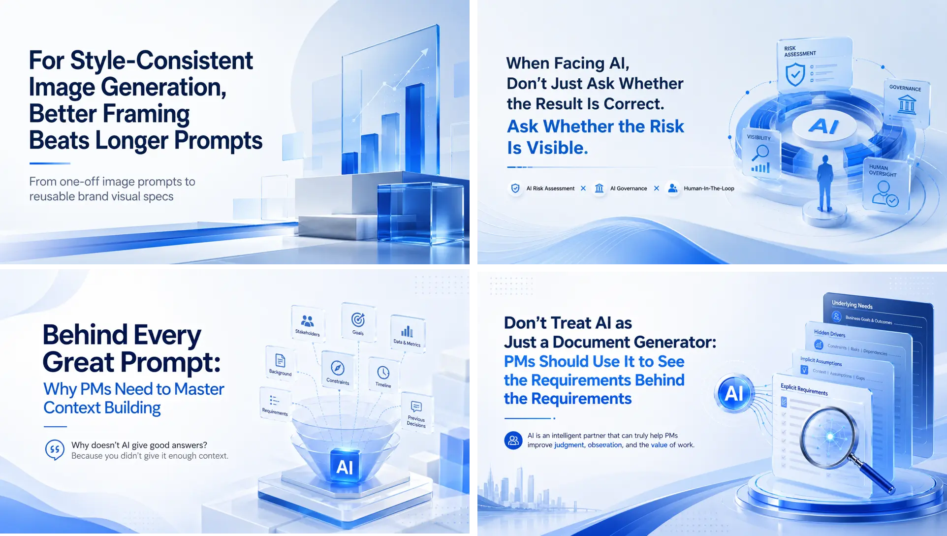
From the colors, block layout, and object arrangement, you can see that they share the same visual style. However, because the topics differ, the geometric objects on the right side also change with the topic.
Basic Prompt Template
Later, I realized that the key is not to make the prompt longer and longer, but to structure the image generation requirements.
When the purpose, topic, audience, style, required elements, and constraints are clearly delineated, AI can converge more consistently toward the same brand direction.
Such a prompt is no longer just a one-off “image generation spell.” It becomes a reusable brand visual spec.
Here is the basic template I use to maintain the style described above:
=============================================

Purpose: [What type of image you want AI to create]
Main idea: [The topic of the image, or the title / main idea of an article or presentation]
Supporting description: [The subtitle of the article or presentation, or a concise summary of the key message]
Audience: [Who this image is intended for, including their background or professional context]
Style: [Description of the image style]
- Style name: [A custom style name for easy identification. Optional.]
- Style description: [A short sentence describing the image style]
- Overall tone: [A description of the overall visual style]
Must have: [Elements that must be included in the image]
Additional instructions: [Special requirements for this image, such as not adding text, or including the topic text in the image]

=============================================
The template above is only a basic concept. You can expand or reduce it depending on your needs.
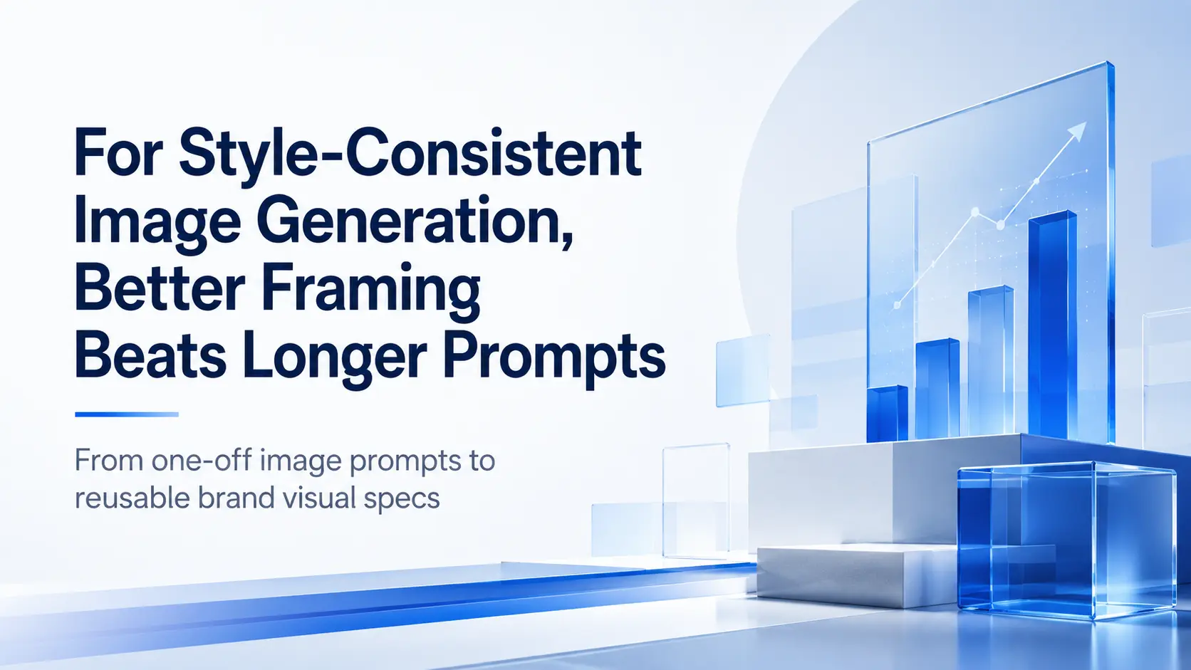
Below is the Hero image prompt I used for this article's title and subtitle.
The point here is not to copy it word for word. The point is to observe how each field plays a different role:
=============================================

Create a professional PowerPoint background image.
Main idea: For Style-Consistent Image Generation, Better Framing Beats Longer Prompts
Supporting description: From one-off image prompts to reusable brand visual specs
Audience: Project Managers and Business Professionals
Style:
  - Style name: Tom’s presentation design
  - Style description: A professional blue visual style suitable for Tom’s presentation materials.
  - Overall tone: Professional, modern, intelligent, practical, trustworthy.
  - Color palette: blue-led palette, white, light neutral tones, soft gray, and subtle gradient accents.
  - Visual language: minimal abstract geometric elements, clean layout, soft spatial depth, refined 3D or glass-like elements, and generous, well-designed negative space.
Must have:
  - Use a modern Tech-Education visual style.
  - Keep the overall composition clean and premium.
  - Leave enough negative space for later placement of the title and subtitle.
  - Use blue as the main accent color.
  - Create a calm, credible, and business-friendly atmosphere.
Additional instructions:
  - Leave enough space for placing the title and subtitle.
  - Place the content of “Main idea” and “Supporting description” on the slide, but do not display the words “Main idea” or “Supporting description.”
  - Keep the overall layout clean and modern.
  - Make it suitable as a 16:9 PowerPoint cover slide.

=============================================
For other versions of the image, I only changed the “Main idea” and “Supporting description” in the prompt of the same prompt.
Adjusting the Template
As mentioned earlier, the template can be adjusted.
Don’t like blue?
Then let’s try a passionate, action-oriented, and inspiring red style.
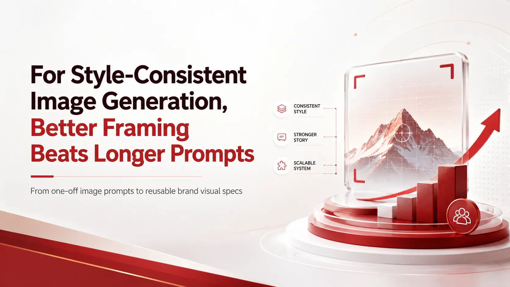
The prompt for the passionate red style is shown below.
Please pay special attention to the descriptions that emphasize “avoid” in the “Overall tone” and “Additional instructions” sections. These are used to limit AI from generating exaggerated or unwanted content.
In an image prompt, “avoid” is not just an optional note. It draws the boundaries of the brand style.
=============================================

Create a professional PowerPoint background image.
Main Idea: For Style-Consistent Image Generation, Better Framing Beats Longer Prompts
Supporting description: From one-off image prompts to reusable brand visual specs
Audience: Project Managers and Business Professionals
Style:
  - Style name: Tom’s presentation design — refined red accent version
  - Style description:
      A professional red visual style suitable for Tom’s presentation materials.
     The overall design uses white and light neutral tones as the base, with deep red, burgundy, and coral red as the main accent colors.
     It should feel powerful and warm, while still remaining refined, restrained, and professional.
  - Overall tone:
    Professional, modern, intelligent, practical, trustworthy.
    Avoid making it overly flame-like, entertainment-oriented, or cheap-looking.
  - Color palette: Use white, light gray, and soft beige as the background base. Use deep red, burgundy, and coral red as the main visual accent colors. Use a small amount of warm orange or soft gold as detail accents. Avoid large areas of highly saturated bright red, overly strong yellow glow, or exaggerated explosion-like effects.
  - Visual language: Use minimal abstract geometric elements, clean layout, soft spatial depth, refined 3D or glass-like elements, and generous, well-designed negative space.
Must have:
  - Use a modern Tech-Education visual style.
  - Keep the overall composition clean, eye-catching, and premium.
  - Leave enough negative space for later text overlay.
  - Use red as the main accent color, but keep it refined, calm, and high-quality, not overly bright or harsh.
  - Create a passionate, action-oriented, and inspiring mood while still remaining credible and business-friendly.
Additional instructions:
  - Leave enough space for placing the title and subtitle.
  - Place the content of “Main idea” and “Supporting description” on the slide, but do not display the words “Main idea” or “Supporting description.”
  - Keep the overall layout clean, modern, and refined.
  - Avoid excessive flames, explosions, lightning, strong light beams, or exaggerated sci-fi effects.
  - Avoid large areas of pure red background. Prefer a white or light neutral background with red accent elements.
  - Make it suitable as a 16:9 PowerPoint cover slide.

=============================================
Notes
Different models may interpret the same prompt differently
The images in this article were created with ChatGPT. However, if the same prompt is used with Google Gemini, Anthropic Claude, or other image models, they may interpret the prompt template's semantics differently.
In other words, the image style they generate may differ. But within the same model, the style generally remains consistent.
The most interesting case was Gemini.
The sentence “Create a professional PowerPoint background image” may not be sufficiently clear to Gemini.
It worked very hard to generate an entire presentation of more than ten slides based on my topic, until I told it:
“Don’t give me a presentation. I only need one image.”
That said, the image quality from Gemini Nano was actually quite good. Its consistency was almost close to “identical.”

Different models from the same brand may also interpret the same prompt differently
Even within ChatGPT, using different model versions may result in differences in image style.
Different reasoning or generation mode settings, such as instant, medium, or high, may also affect the image content and style.
Therefore, if you want the most stable output, try to use the same model from the same provider whenever possible.
One final reminder: this method is not intended to produce the exact same image every time.
If what you need is a highly reproducible version of the same image, that involves controlling the seed, model version, parameters, and tool platform.
But for most corporate presentations, article covers, social media visuals, or course materials, the more common need is this:
Different topics can have different content, but the overall visual style should still clearly belong to the same brand.
So, the key to generating style-consistent images is not to make the prompt longer. It is to frame the purpose, topic, audience, style, and constraints more precisely.
When a prompt is no longer just a sentence of inspiration but a reusable brand visual spec, AI image generation becomes more controllable, more manageable, and better suited to everyday business workflows.
Style consistency does not mean making every image look the same.
It means making every image feel like it belongs to the same brand.